
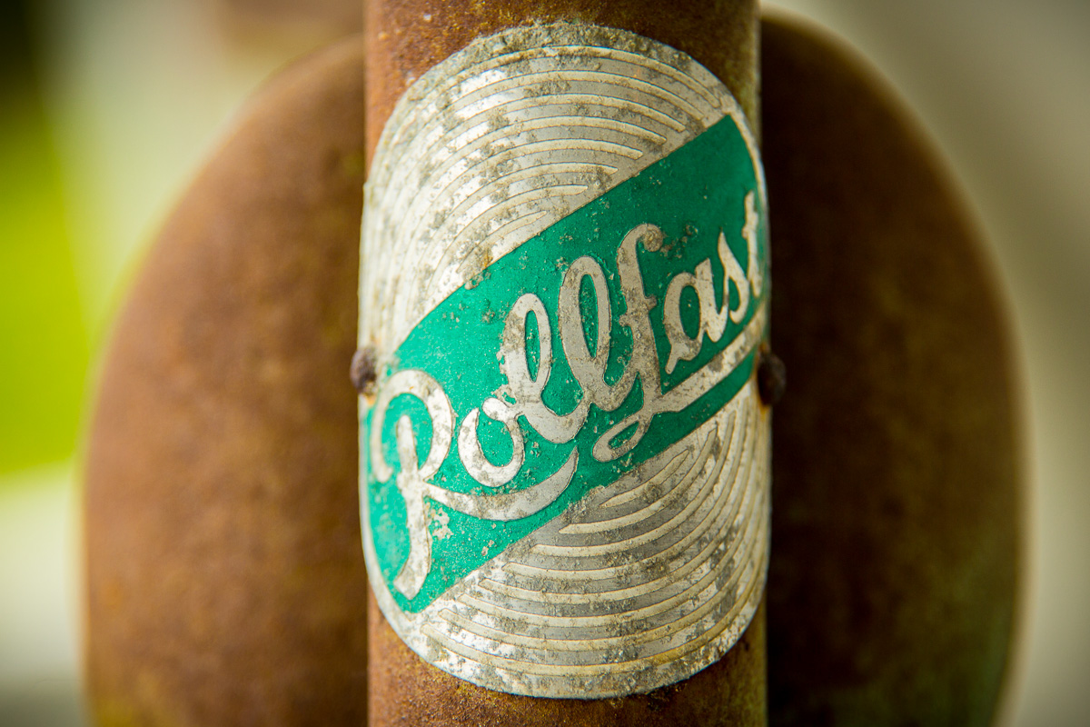
Look at that lowercase “ƒ”. Killer. Capital “R” isn’t a slouch, either.
The rust patina lends itself as a complimentary color to the aqua/mint background on the logo. Especially the shape of the top bar which recalls a motorcycle gas tank. I did some research and couldn’t find the exact model. I’m guessing it’s a 1950s-era bike.